What is Data Visualization? Tools, Techniques and Applications
Data visualization is the art and science of transforming complex data sets into an understandable, visual form. In today’s world, everyone from businesses to academics, marketers to data scientists are working with big data. However, this data can often be complex and difficult to understand in its raw form. This is where data visualization comes in! Graphs, charts, maps and interactive dashboards help data make sense, tell stories and accelerate decision-making processes.
What is Data Visualization?
Data visualization involves creating visual representations of numerical or categorical data. This process helps users quickly identify patterns, trends, and relationships in the data. For example, a pie chart simplifies a sales report, instantly revealing which product sells the most compared to a lengthy table.
This method serves as both an aesthetic presentation and a strategic tool. Businesses use it to analyze customer behavior, track market trends, or boost operational efficiency. In academia, researchers share findings effectively through visualization. In short, data visualization drives data-informed decision-making.
Why is it Important?
-
Easy Understandability: Visuals clarify complex data.
-
Fast Analysis: Users can quickly detect trends and anomalies.
-
Effective Communication: Visuals convey data clearly to non-technical audiences.
-
Storytelling: Visuals transform data into compelling narratives.
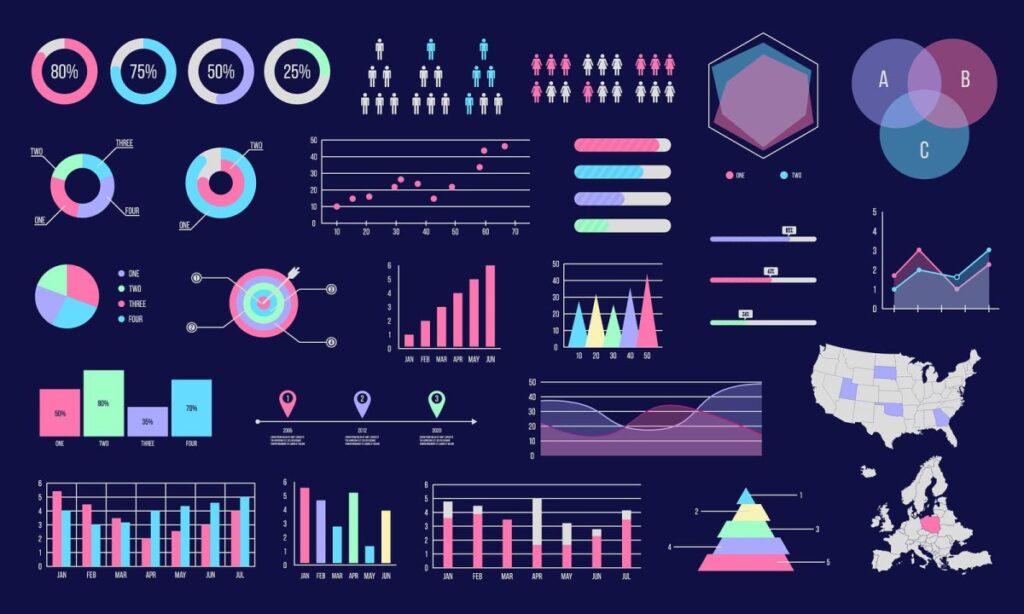
Data Visualization Techniques
Different visualization techniques suit various data types and audiences. Here are the most common ones:
1. Bar Charts
Bar charts excel at comparing categorical data. For example, analysts use them to compare sales figures across cities, offering a clear and simple structure.
2. Line Graphs
Line graphs effectively display changes over time. For example, analysts use them to track a website’s monthly visitor numbers, clearly highlighting trends.
3. Pie Charts
Pie charts illustrate parts of a whole. For example, analysts use them to show a company’s revenue source distribution. However, they can become complex with too many categories.
4. Heat Maps
Heat maps use color shades to represent data density or correlations. For example, analysts employ them to identify the most-clicked areas on a website.
5. Scatter Charts
Scatter charts reveal relationships between two variables. For example, analysts use them to explore the connection between advertising expenditure and sales.
6. Geographic Maps
Geographic maps visualize location-based data. For example, analysts display a retail chain’s store sales on a map.
7. Interactive Dashboards
Interactive dashboards combine multiple visualization types for comprehensive analysis. Users explore data dynamically using filters and buttons.
Popular Data Visualization Tools
Numerous tools simplify data visualization, with free and paid options meeting diverse needs. Here are the most popular tools:
1. Tableau
Tableau, a professional platform, transforms large data sets into interactive dashboards. It stands out for its user-friendly interface and powerful analytics features, but it costs money and can take time to learn.
2. Power BI
Microsoft’s Power BI tool is a popular option for business intelligence. Its integration with Excel and cloud-based features make it ideal for businesses. Available in free and paid versions.
3. Google Looker Studio
Google Looker Studio, a free tool, easily integrates with Google Analytics. It is suitable for creating simple reports and interactive dashboards.
4. D3.js
D3.js, a JavaScript library for developers, offers customized and dynamic visualizations. Requires technical knowledge, but provides flexibility.
5. Python (Matplotlib, Seaborn, Plotly)
Python is frequently used for data science and offers powerful visualizations with libraries like Matplotlib, Seaborn, Plotly. Requires programming knowledge.
6. Excel
For simple visualizations, Excel is still a common option. It can be used to create bar charts, pie charts and line graphs, but is limited in large data sets.
Data Visualization Applications
It is used for various purposes in different sectors. Here are some examples:
Marketing: Monitor campaign performance and analyze customer segmentation.
Finance: Budget analysis, stock trends and risk assessments.
Health: Analyzing patient data and visualizing epidemiological trends.
Education: Monitor student performance and measure the effectiveness of educational programs.
E-commerce: Analyzing sales funnels and customer behavior.
What to Consider When Doing Data Visualization?
For a successful visualization, some principles should be considered:
Simplicity: Avoid unnecessary details and communicate your message clearly.
The Right Tool: Choose a tool that suits your data and target audience.
Color Usage: Use colors responsibly; for example, choose appropriate contrasts for color blindness.
Accuracy: Visuals should not distort or mislead data.
Accessibility: Visuals should be understandable for everyone.
Ultimately, data visualization is an effective way to understand and share data. With the right tools and techniques, you can turn complex data sets into meaningful stories. From professional tools like Tableau and Power BI to accessible options like Excel, there are many possibilities. The important thing is to create simple and effective visuals that are suitable for your target audience.
Lorem ipsum dolor sit amet, consectetur adipiscing elit. Ut elit tellus, luctus nec ullamcorper mattis, pulvinar dapibus leo.